
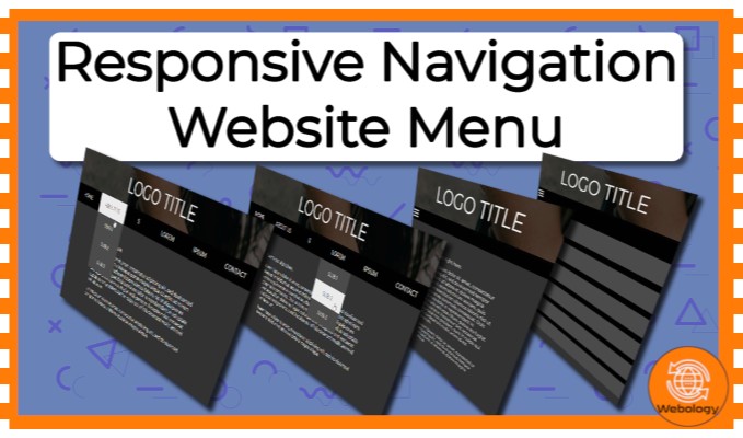
Responsive Website Navigation Menu


製品情報
¥15,339
 買い物カゴに追加
 PieceX検証済み
デベロッパー
公開チャット
製品詳細
This layout is responsive and designed for 3 resolutions: desktop, tablet and mobile.
On mobile the layout uses a menu button to open the navigation.
How to Use:
You can find this in the index.html, that comes in the project files, for easy copy and paste.
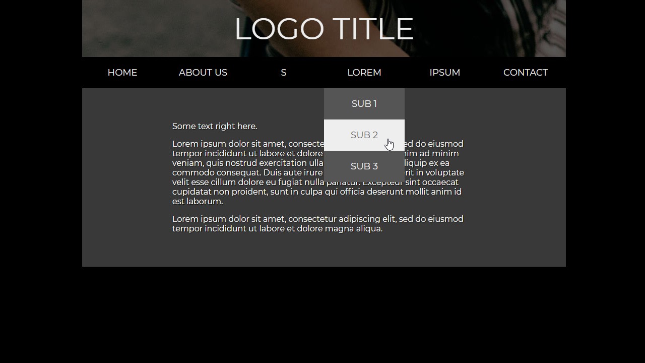
The markup structure is encapsulated with the div of the class container. In it exists a header div, which contains a logo div and a navigation div.
You can see all of the examples in the index.html of course, play around with them.
Simply drop the header or just the navigation into your project, change it and use it.
Check the guide PDF if needed. The markup structure is encapsulated with the div of the class container. In it exists a header div, which contains a logo div and a navigation div. Simply drop the header or just the navigation into your project, change it and use it. Check the guide PDF if needed.
ファイルツリー
-
📁 Responsive Website Navigation Menu
価格情報
価格の統計
インサイト


関連製品
-


Multiplayer 3D JavaScript Game
The source code for dungeon-Born.com is built in JavaScript, using Babylon.js as the primary 3D framework to render immersive environments and complex character interactions. Node.js powers the backend, facilitating efficient server management and gameplay logic, while WebSockets handle real-time co
added by Rafael So
¥15,014
-

ecommerce react laravel
Key Features: Admin Dashboard: Manage products, orders, users, and more with an intuitive admin interface. Delivery Boy Integration: Efficiently track and manage deliveries with dedicated features for delivery personnel. Single Page Application (SPA): Smooth, dynamic, and fast user experien
added by Adichhapekar
¥14,818
-

PulseConnect Blood Donation Management System
- User Registration: Register as a blood donor with ease. - Blood Donation Requests: Easily request blood donations when in need. - Donation Camps: Discover nearby blood donation camps and events. - Inventory Management: Blood banks can efficiently manage their inventory. - Real-time Communicati
added by Soumik Saha
¥14,845


 Cookieを利用しています。


