Responsive Website Navigation Menu
Desenvolvedor
Chat público
Detalhes do produto
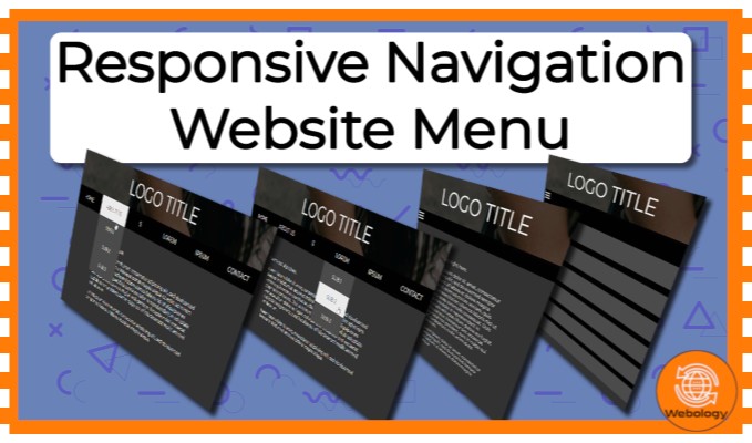
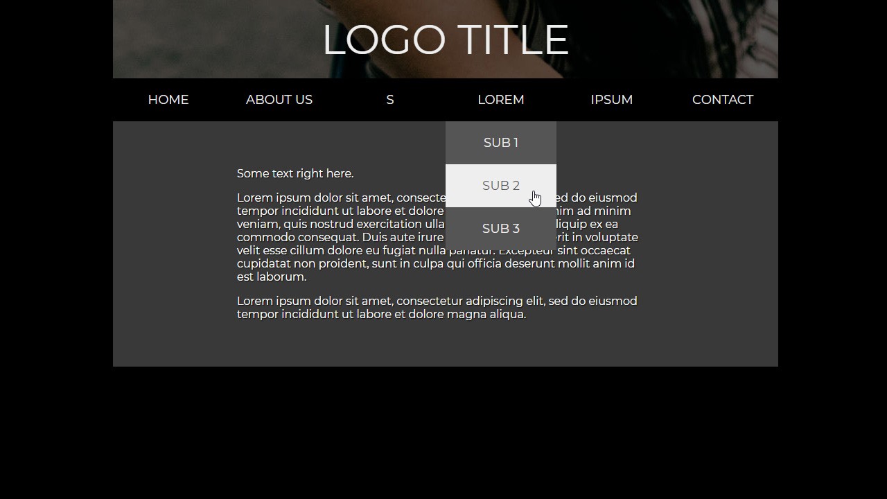
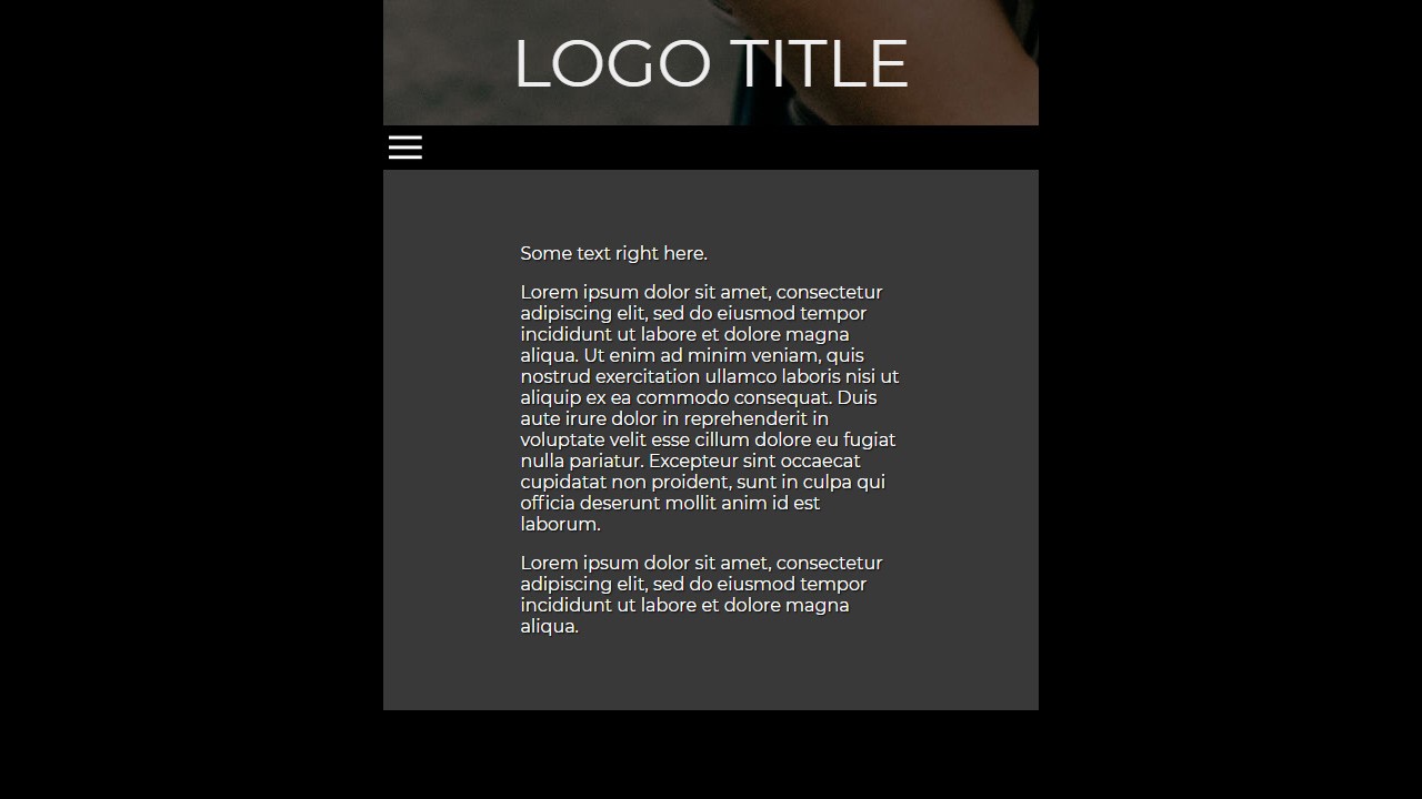
This layout is responsive and designed for 3 resolutions: desktop, tablet and mobile.
On mobile the layout uses a menu button to open the navigation.
How to Use:
You can find this in the index.html, that comes in the project files, for easy copy and paste.
The markup structure is encapsulated with the div of the class container. In it exists a header div, which contains a logo div and a navigation div.
You can see all of the examples in the index.html of course, play around with them.
Simply drop the header or just the navigation into your project, change it and use it.
Check the guide PDF if needed. The markup structure is encapsulated with the div of the class container. In it exists a header div, which contains a logo div and a navigation div. Simply drop the header or just the navigation into your project, change it and use it. Check the guide PDF if needed.
Árvore de arquivos
-
📁 Responsive Website Navigation Menu


 Adicionar ao carrinho


