
Material-dashboard-angular2

제품 정보
오픈소스 사용 사례
공개 채팅
지원 계획
현재 사용할 수 있는 OSS 플랜이 없습니다.
저장소의 제공자 또는 기여자인 경우 OSS 플랜 추가를 시작할 수 있습니다.
OSS 플랜 추가이 오픈소스에 대한 플랜을 찾고 있다면 저희에게 문의해 주세요.
전문 공급자와 연락하실 수 있도록 도와드리겠습니다.
제품 세부 정보
Material Dashboard Angular - Free Bootstrap Material Design Admin
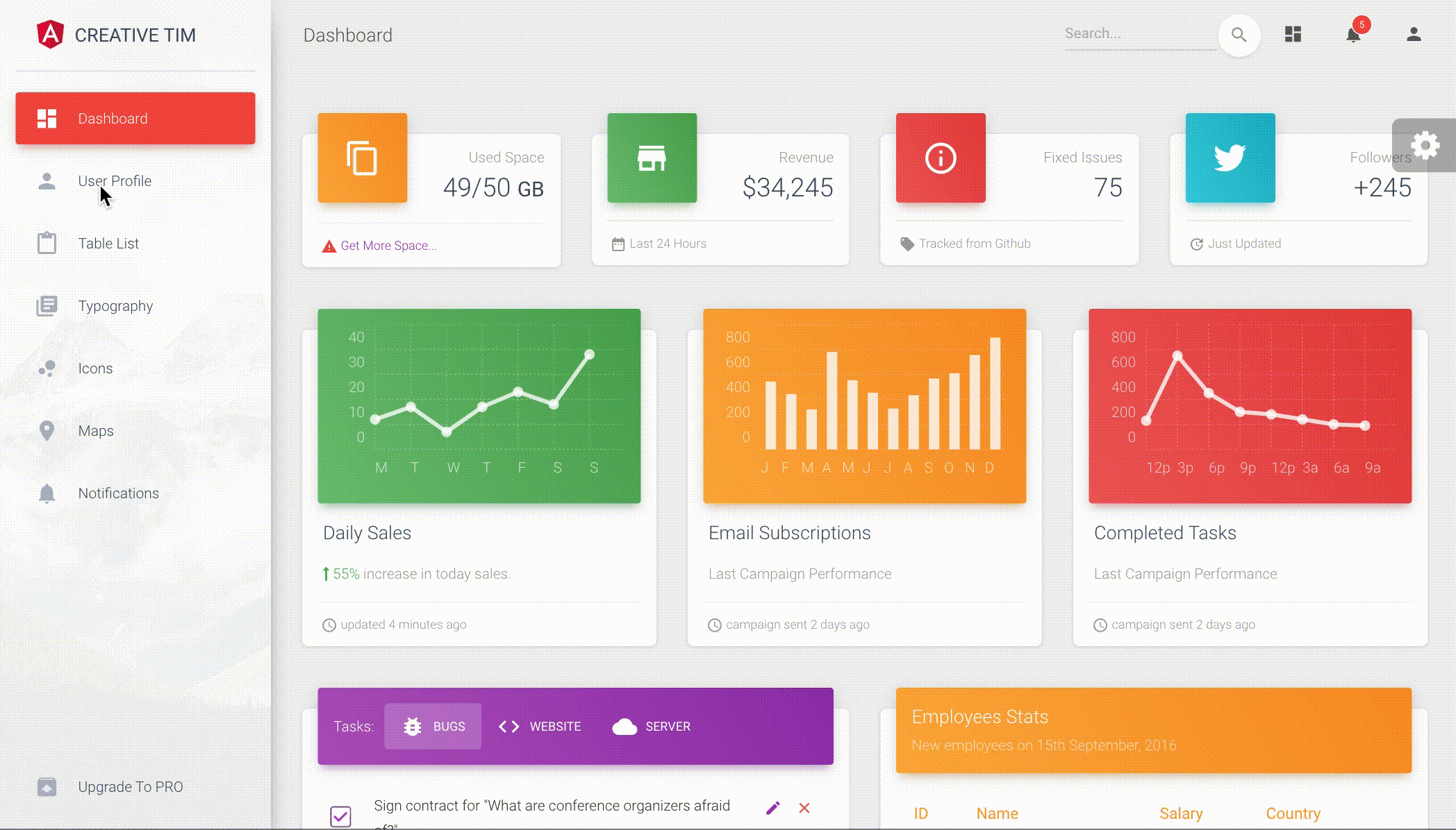
Material Dashboard Angular is a free Material Bootstrap Admin with a fresh, new design inspired by Google's Material Design. We are very excited to introduce our take on the material concepts through an easy to use and beautiful set of components. Material Dashboard was built over the popular Bootstrap framework and it comes with a couple of third-party plugins redesigned to fit in with the rest of the elements.
Material Dashboard makes use of light, surface and movement. The general layout resembles sheets of paper following multiple different layers, so that the depth and order is obvious. The navigation stays mainly on the left sidebar and the content is on the right inside the main panel.
This product came as a result of users asking for a material dashboard after we released our successful Material Kit. We developed it based on your feedback and it is a powerful bootstrap admin dashboard, which allows you to build products like admin panels, content managements systems and CRMs.
Material Dashboard comes with 5 color filter choices for both the sidebar and the card headers (blue, green, orange, red and purple) and an option to have a background image on the sidebar.
Material Dashboard uses a framework built by our friend Federico - Bootstrap Material Design, who did an amazing job creating the backbone for the material effects, animations, ripples and transitions. Big thanks to his team for the effort and forward thinking they put into it.
Special thanks go to: Robert McIntosh for the notification system. Chartist for the wonderful charts. We are very excited to share this dashboard with you and we look forward to hearing your feedback!
You can find the Github Repo here.
Table of Contents
- Versions
- Demo
- Quick Start
- Deploy
- Documentation
- File Structure
- Browser Support
- Resources
- Reporting Issues
- Technical Support or Questions
- Licensing
- Useful Links
Versions
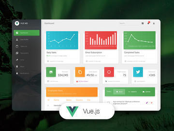
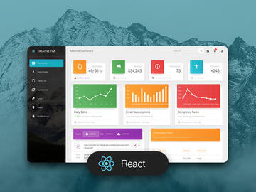
| HTML | Angular | Vue | React |
|---|---|---|---|
 |
 |
 |
 |
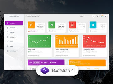
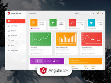
Demo
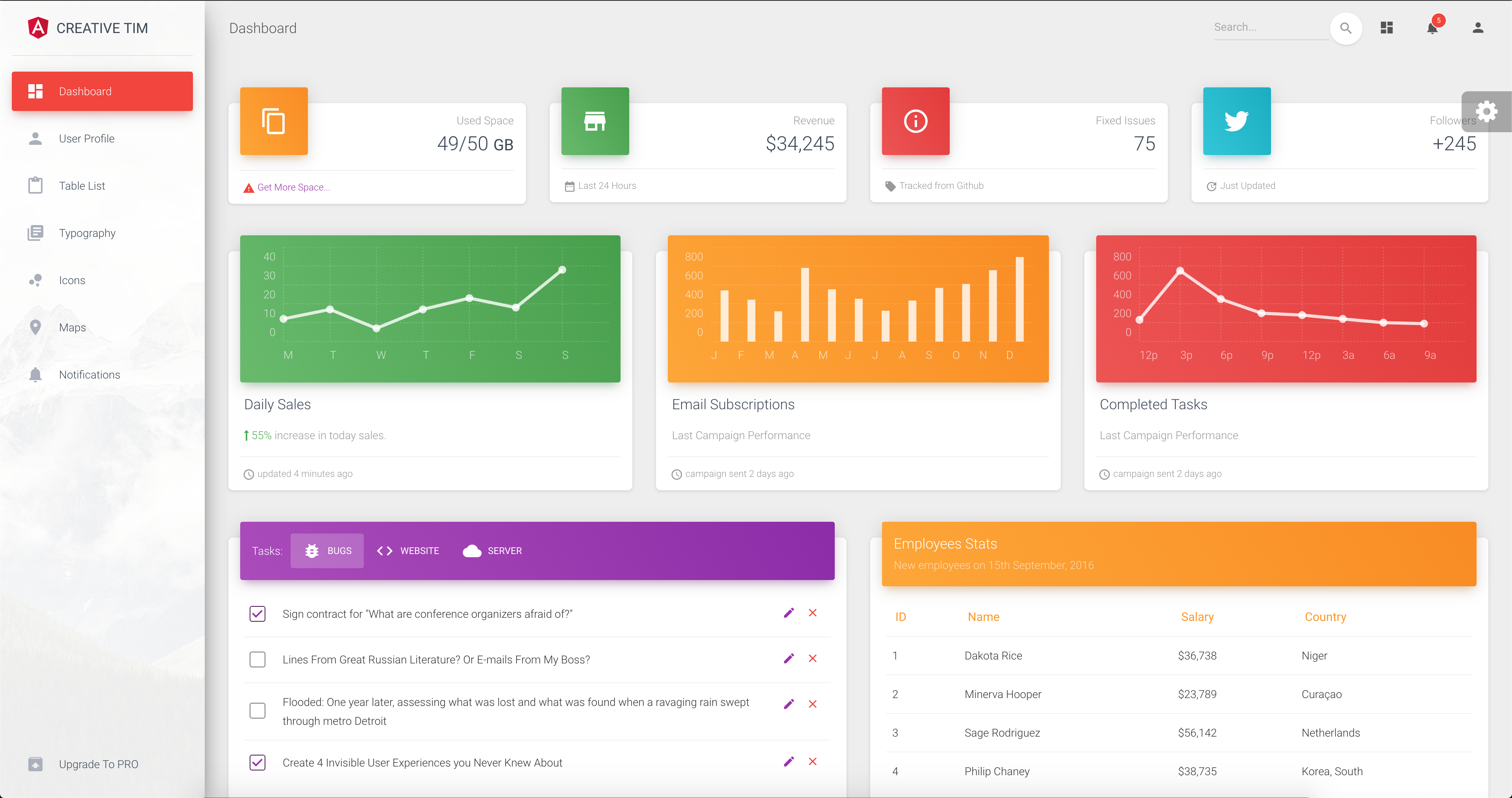
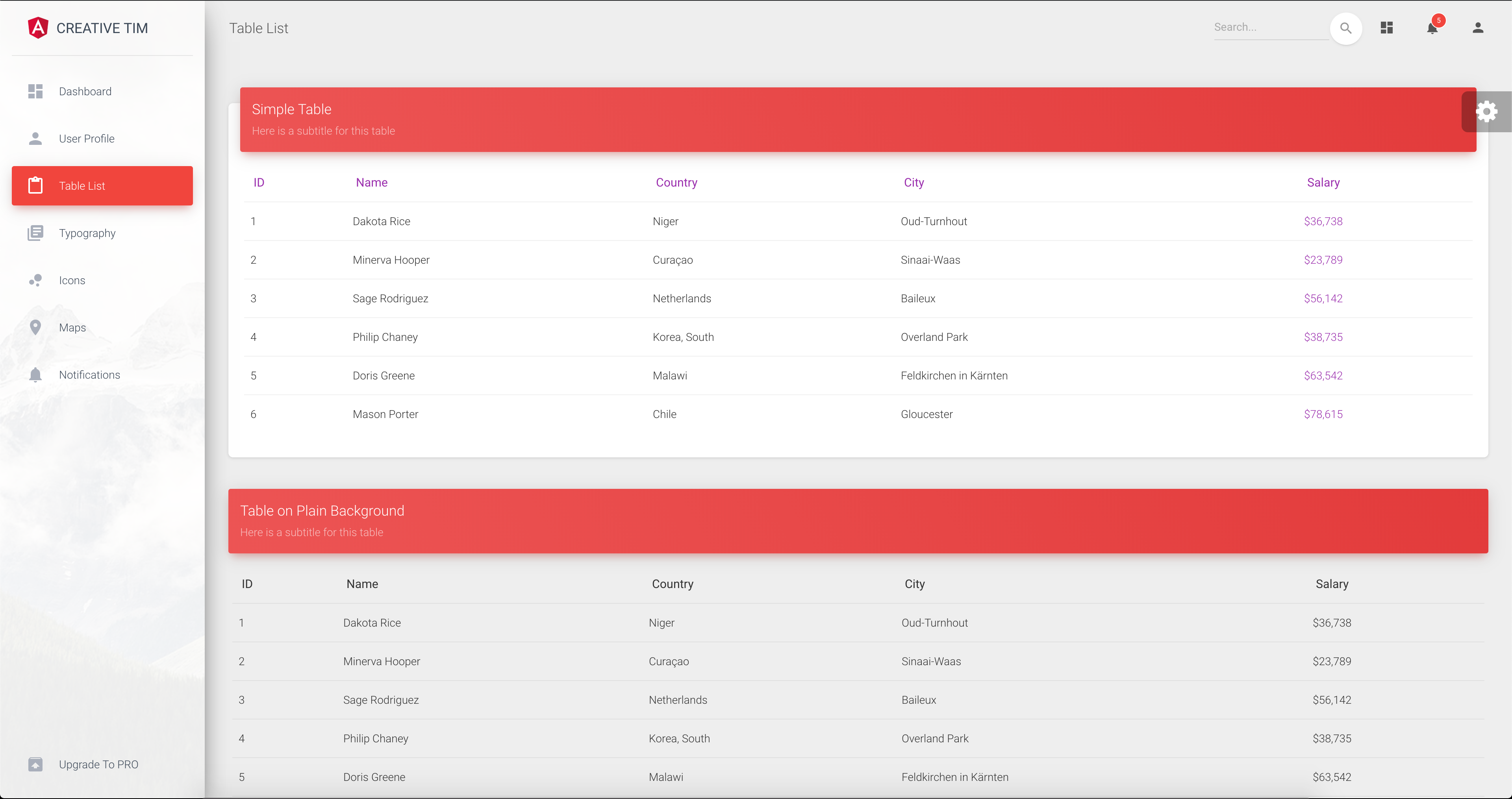
| Dashboard | User Profile | Tables | Icons | Notifications |
|---|---|---|---|---|
 |
 |
 |
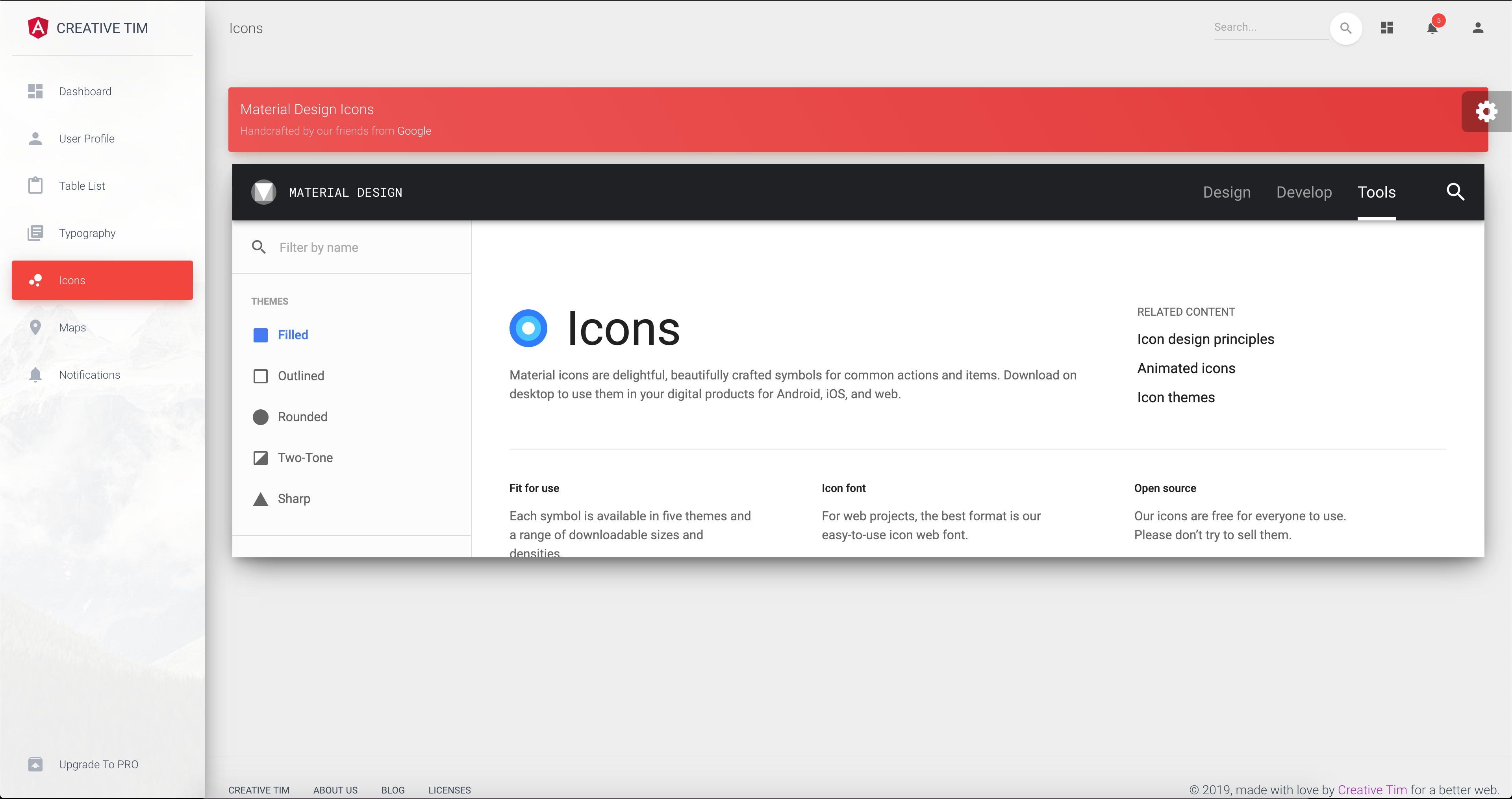 |
 |
Quick start
Quick start options:
Deploy
:rocket: You can deploy your own version of the template to Genezio with one click:

Terminal Commands
This project was generated with Angular CLI version 1.0.0 and angular 4.x.
- Install NodeJs from NodeJs Official Page.
- Open Terminal
- Go to your file project
- Make sure you have installed Angular CLI already. If not, please install.
- Run in terminal:
npm install - Run
ng servefor a dev server. Navigate tohttp://localhost:4200/. The app will automatically reload if you change any of the source files.
To get more help on the Angular CLI use ng help or go check out the Angular CLI README.
What's included
Within the download you'll find the following directories and files:
material-dashboard-angular
├── CHANGELOG.md
├── LICENSE.md
├── README.md
├── angular-cli.json
├── documentation
├── e2e
├── karma.conf.js
├── package-lock.json
├── package.json
├── protractor.conf.js
├── src
│   ├── app
│   │   ├── app.component.css
│   │   ├── app.component.html
│   │   ├── app.component.spec.ts
│   │   ├── app.component.ts
│   │   ├── app.module.ts
│   │   ├── app.routing.ts
│   │   ├── components
│   │   │   ├── components.module.ts
│   │   │   ├── footer
│   │   │   │   ├── footer.component.css
│   │   │   │   ├── footer.component.html
│   │   │   │   ├── footer.component.spec.ts
│   │   │   │   └── footer.component.ts
│   │   │   ├── navbar
│   │   │   │   ├── navbar.component.css
│   │   │   │   ├── navbar.component.html
│   │   │   │   ├── navbar.component.spec.ts
│   │   │   │   └── navbar.component.ts
│   │   │   └── sidebar
│   │   │       ├── sidebar.component.css
│   │   │       ├── sidebar.component.html
│   │   │       ├── sidebar.component.spec.ts
│   │   │       └── sidebar.component.ts
│   │   ├── dashboard
│   │   │   ├── dashboard.component.css
│   │   │   ├── dashboard.component.html
│   │   │   ├── dashboard.component.spec.ts
│   │   │   └── dashboard.component.ts
│   │   ├── icons
│   │   │   ├── icons.component.css
│   │   │   ├── icons.component.html
│   │   │   ├── icons.component.spec.ts
│   │   │   └── icons.component.ts
│   │   ├── layouts
│   │   │   └── admin-layout
│   │   │       ├── admin-layout.component.html
│   │   │       ├── admin-layout.component.scss
│   │   │       ├── admin-layout.component.spec.ts
│   │   │       ├── admin-layout.component.ts
│   │   │       ├── admin-layout.module.ts
│   │   │       └── admin-layout.routing.ts
│   │   ├── maps
│   │   │   ├── maps.component.css
│   │   │   ├── maps.component.html
│   │   │   ├── maps.component.spec.ts
│   │   │   └── maps.component.ts
│   │   ├── notifications
│   │   │   ├── notifications.component.css
│   │   │   ├── notifications.component.html
│   │   │   ├── notifications.component.spec.ts
│   │   │   └── notifications.component.ts
│   │   ├── table-list
│   │   │   ├── table-list.component.css
│   │   │   ├── table-list.component.html
│   │   │   ├── table-list.component.spec.ts
│   │   │   └── table-list.component.ts
│   │   ├── typography
│   │   │   ├── typography.component.css
│   │   │   ├── typography.component.html
│   │   │   ├── typography.component.spec.ts
│   │   │   └── typography.component.ts
│   │   ├── upgrade
│   │   │   ├── upgrade.component.css
│   │   │   ├── upgrade.component.html
│   │   │   ├── upgrade.component.spec.ts
│   │   │   └── upgrade.component.ts
│   │   └── user-profile
│   │       ├── user-profile.component.css
│   │       ├── user-profile.component.html
│   │       ├── user-profile.component.spec.ts
│   │       └── user-profile.component.ts
│   ├── assets
│   │   ├── css
│   │   │   └── demo.css
│   │   ├── img
│   │   └── scss
│   │       ├── core
│   │       └── material-dashboard.scss
│   ├── environments
│   ├── favicon.ico
│   ├── index.html
│   ├── main.ts
│   ├── polyfills.ts
│   ├── styles.css
│   ├── test.ts
│   ├── tsconfig.app.json
│   ├── tsconfig.spec.json
│   └── typings.d.ts
├── tsconfig.json
├── tslint.json
└── typings
Browser Support
At present, we officially aim to support the last two versions of the following browsers:


Resources
- Demo: https://demos.creative-tim.com/material-dashboard-angular2/#/dashboard
- Download Page: https://www.creative-tim.com/product/material-dashboard-angular2
- Documentation: https://demos.creative-tim.com/material-dashboard-angular2/#/documentation/tutorial
- License Agreement: https://www.creative-tim.com/license
- Support: https://www.creative-tim.com/contact-us
- Issues: Github Issues Page
- Material Kit - For Front End Development
Reporting Issues
We use GitHub Issues as the official bug tracker for the Material Dashboard. Here are some advices for our users that want to report an issue:
- Make sure that you are using the latest version of the Material Dashboard. Check the CHANGELOG from your dashboard on our website.
- Providing us reproducible steps for the issue will shorten the time it takes for it to be fixed.
- Some issues may be browser specific, so specifying in what browser you encountered the issue might help.
Technical Support or Questions
If you have questions or need help integrating the product please contact us instead of opening an issue.
Licensing
-
Copyright 2018 Creative Tim (https://www.creative-tim.com/)
-
Licensed under MIT (https://github.com/creativetimofficial/material-dashboard-angular2/blob/master/LICENSE.md)
Useful Links
- More products from Creative Tim
- Tutorials
- Freebies from Creative Tim
- Affiliate Program (earn money)
Social Media
Twitter: https://twitter.com/CreativeTim
Facebook: https://www.facebook.com/CreativeTim
Dribbble: https://dribbble.com/creativetim


 쿠키 타임!


